
Tendencias en rubor de sien y rubor con efecto lifting: ¿Qué formas y tonos de paleta se venden mejor?
El rubor se ha desplazado hacia arriba. En lugar de aplicarlo solo en las manzanas de las mejillas, muchos looks ahora lo extienden hacia el pómulo exterior y la sien. El efecto puede hacer que el rostro parezca más abierto y ligeramente rejuvenecido, especialmente en videos cortos de belleza donde la aplicación se ve antes que el resto de la rutina. Para una marca, el rubor en las sienes no es solo una frase más en los tutoriales. Cambia la pigmentación, la forma del envase, el aplicador y la mezcla de tonos que hacen que un producto se vea actual en el estante.
La tendencia de los rubores más llamativos no implica que todas las colecciones deban incluir una paleta rosa brillante. La versión más comercializable suele ser más selecta: tonos que se difuminan fácilmente desde la mejilla hasta la sien, un envase que facilita la aplicación y colores que resultan atractivos tanto en un vídeo corto como a la luz del día.
¿Por qué Temple Blush cambia el desarrollo de productos?
La aplicación tradicional en las mejillas permite un rubor redondo y concentrado. La aplicación en las sienes requiere más tolerancia. El producto se extiende por una zona más amplia, a menudo sobre el pómulo superior, por lo que un borde marcado o una zona irregular se nota rápidamente. Esto favorece el uso de polvos difuminadores suaves, bálsamos deslizantes y líquidos que se pueden aplicar en capas finas. También exige una mayor precisión en la elección del tono. Un color que luce fresco en el centro de la mejilla puede verse recargado al llegar a la línea del cabello.
El rubor ya cumple múltiples funciones en un look de maquillaje. Ilumina el rostro, ayuda a definirlo y armoniza el color de ojos y labios. La tendencia de aplicarlo en las sienes hace que esta función de coordinación sea aún más visible. Un tono melocotón cálido puede combinar con bronceador y labios brillantes; un rosa suave puede unir un maquillaje de ojos delicado con un labial nude. Por lo tanto, la paleta de rubor ideal se basa en combinaciones armoniosas, no en colores llamativos y aislados.
La capacidad de mezcla es más importante que una primera muestra impactante.
Los productos destinados a realzar el color deben difuminarse antes de alcanzar su intensidad máxima. El colorete en polvo se puede aplicar en capas controladas, mientras que la crema proporciona un acabado suave y natural. El colorete líquido suele elegirse por su efecto translúcido, ya que se puede extender una pequeña cantidad antes de que se fije. La fórmula debe tener suficiente pigmento para su uso en redes sociales, pero no debe fijarse al primer toque ni dejar una marca en el pómulo.
Las familias de tonos que llevan la tendencia al comercio minorista
Una colección que sigue las tendencias necesita una base sólida. Para el rubor de sien, las familias de tonos más destacadas suelen ser melocotón suave, albaricoque, rosa nude, beige rosado, terracota cálido y rosa baya. Estos tonos crean un efecto lifting sin recargar el rostro. El rojo brillante y el rosa chicle frío pueden funcionar como colores de campaña, pero no deberían dominar el catálogo inicial a menos que la marca ya tenga un público objetivo definido para ellos.
El bálsamo colorete Soft Light de L&J Cosmetics viene en tonos albaricoque, rosa nude, rosa pálido y rosa, con una textura suave, delicada y humectante. Su formato en crema colorete utiliza tonos rojo rosado, rosa, rojo, rosa nude, naranja y naranja oscuro en un envase redondo de 8 g. Estos grupos de colores demuestran por qué una línea de coloretes de marca propia puede parecer amplia sin depender de docenas de tonos inconexos: la verdadera elección reside en familias de tonos bien definidas y tonos casi idénticos.
Utilice los tonos oscuros para dar forma, no como un añadido posterior.
Los tonos más intensos de rubor merecen un lugar destacado en la paleta. Un terracota intenso, un rosa pasas o un marrón rojizo pueden aportar calidez y dimensión a las pieles más oscuras, y favorecer el efecto lifting al aplicarlos ligeramente hacia la sien. Omitir estos tonos reduce la utilidad de la gama. Añadir un naranja oscuro sin un subtono equilibrado no es suficiente. Es necesario comprobar la pigmentación y la transparencia en pieles más oscuras antes del lanzamiento.
Formas de paleta que facilitan la elección del tono
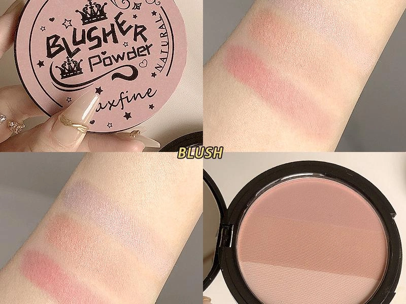
La forma ideal de la paleta depende de si la marca busca una rutina guiada o una paleta de colores flexible. Una paleta de dos tonos funciona bien cuando los tonos tienen funciones claramente diferenciadas, como un rubor suave para todo el rostro y un rubor más intenso para contornear. Una paleta de tres tonos permite añadir un tono suave similar al iluminador o un iluminador para aplicar sobre el rostro, pero los tonos deben ser lo suficientemente grandes para una brocha estándar. Demasiados tonos pequeños dificultan la aplicación en las sienes y pueden convertir una paleta útil en un simple objeto decorativo.
A Colorete en polvo 3 en 1 Es una opción interesante para las marcas que buscan varios tonos coordinados en un solo estuche compacto. El producto debe guiar al comprador sin imponer una secuencia fija. Por ejemplo, un melocotón claro, un beige rosado y un marrón cálido se pueden usar solos, mezclados para lograr un rubor personalizado o aplicados desde la mejilla hasta la sien en un suave degradado.
La geometría de la bandeja debe coincidir con la del aplicador.
Los envases redondeados son ideales para una brocha compacta y una aplicación suave de polvos. Los envases rectangulares más anchos facilitan la aplicación del producto a lo largo del pómulo. Los pequeños compartimentos abovedados para cremas pueden usarse con los dedos, pero una abertura demasiado estrecha dificulta la aplicación con brocha. La forma del componente no es una decisión puramente visual. Influye en la recogida, la caída de producto, la higiene y la facilidad con la que el consumidor puede reproducir la aplicación que ve en línea.
Polvo, crema, barra o líquido para un efecto lifting.
El polvo es la opción más común para una paleta de colorete porque permite una aplicación gradual y mantiene visible la gama de colores. El disco de seis colores de L&J Cosmetics utiliza polvo suave con cuatro estilos diferentes, ideal para marcas que buscan un compacto versátil. La crema proporciona mayor contacto con la piel y crea un acabado suave y aterciopelado. Un bálsamo para colorete ofrece una sensación hidratante y suave, mientras que un bálsamo mate resistente al agua también se puede usar en ojos, mejillas y labios. Estas son opciones útiles para lograr un maquillaje de rostro coordinado.
Para una aplicación precisa de la crema, Colorete en barra cremoso Ofrece a los compradores una línea directa desde la mejilla hasta la sien. El tamaño y la redondez de la bala permiten una primera pasada ligera, ya que una franja opaca y gruesa es difícil de suavizar una vez aplicada sobre la base de maquillaje. Un lápiz puede ser una buena opción para viajar, pero se debe verificar el ajuste de la tapa, la facilidad de giro y la estabilidad térmica, además del resultado.
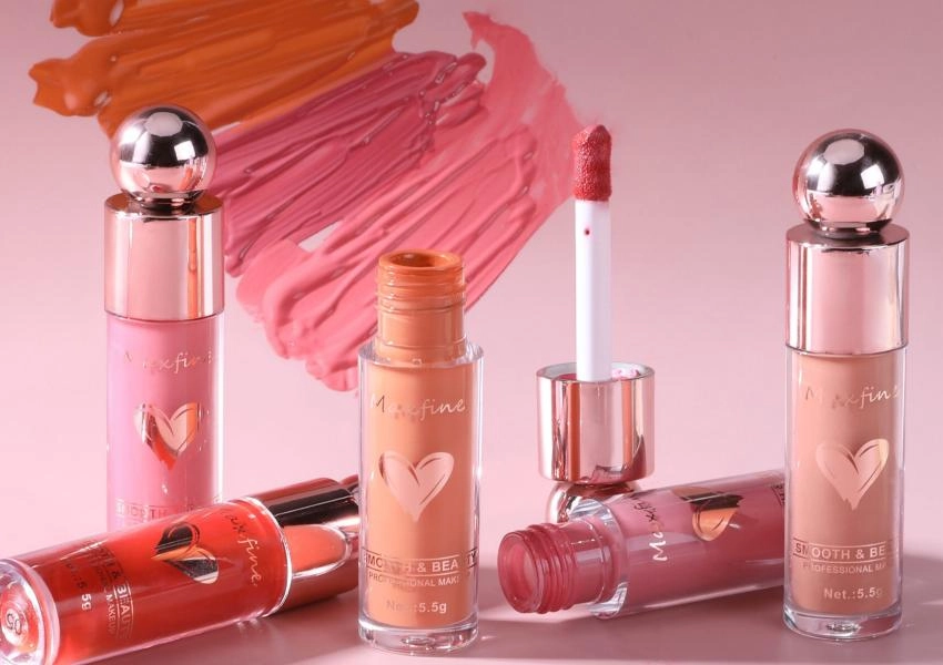
Liquid es otra buena opción cuando la marca busca un acabado transparente y con varias capas. Colorete líquido de doble uso para labios y mejillas Naturalmente, permite la aplicación en puntos pequeños que muchos consumidores utilizan para lograr un efecto lifting. La fórmula necesita suficiente deslizamiento para extenderse y luego un tiempo de secado adecuado para que no mueva la base de maquillaje. Una fórmula separada colorete líquido Esta orientación puede ser útil para las marcas que prefieren un formato específico para cada mejilla en lugar de una afirmación de uso múltiple.
Informe comercial sobre la tendencia del rubor para 2026.
Un brief conciso debe identificar el punto de venta objetivo, el acabado, la intensidad, las familias de tonos clave, la forma del envase y si el producto es un producto estrella individual, un dúo o una paleta. También debe indicar dónde se venderá la gama. Un colorete de alta pigmentación para una campaña publicitaria puede funcionar bien para un lanzamiento liderado por un creador, mientras que una gama de tonos melocotón-rosa más suaves puede ser mejor para el comercio minorista general. Las pruebas deben incluir la aplicación sobre bases de maquillaje comunes, la visibilidad en cámara, el tiempo de difuminado y el rendimiento del tono en una gama real de tonos de piel.
A medida que su producto avanza a la etapa de desarrollo posterior, L& J Cosméticos Podemos convertir sus ideas en muestras físicas de todos nuestros productos de color para el rostro en polvo, crema, barra y líquido mediante nuestro servicio OEM/ODM. Con más de 150 empleados y una superficie de producción de más de 20 000 metros cuadrados, podemos brindar soporte integral al proceso de desarrollo del producto, incluyendo discusiones sobre la fórmula, los tonos, los componentes y una prueba piloto para determinar si su nueva idea de rubor para las sienes se lanzaría mejor como producto individual o como parte de una gama más amplia de productos coordinados.
El rubor en las sienes seguirá vigente incluso después de que las tendencias pasajeras se hayan desvanecido, ya que el simple efecto visual del color que realza y define el rostro y los rasgos faciales continuará atrayendo a los consumidores. Las marcas que logren plasmar esta idea en tonos favorecedores, envases de tamaño adecuado y una fácil aplicación tendrán un producto más sólido que aquellas que solo buscan un eslogan viral.
Preguntas frecuentes
P1: ¿Qué es el rubor en las sienes?
A1: El rubor en las sienes se aplica difuminando el color desde la parte superior del pómulo hacia la sien. Esta aplicación se utiliza para crear un rubor que realce la apariencia de los ojos y para conectar el rubor con la zona de los ojos.
P2: ¿Qué tonos funcionan mejor para conseguir un rubor radiante?
A2: Los tonos melocotón suave, albaricoque, rosa nude, beige rosado, terracota, rosa baya y marrón rojizo suelen mezclarse bien en la parte superior de la mejilla y la sien cuando se controla la intensidad.
P3: ¿Es mejor aplicar rubor en las sienes con polvos o en crema?
A3: El polvo permite una aplicación gradual, mientras que la crema proporciona un acabado más natural. La mejor opción depende del público objetivo, el resultado deseado, el envase y el método de aplicación.
P4: ¿Cuántas pastillas debería tener una paleta de colorete?
A4: Dos o tres paletas grandes suelen ser más fáciles de usar que muchas paletas pequeñas. La disposición ideal permite a los compradores tomar el color con su pincel habitual y ver claramente el propósito de cada tono.
P5: ¿Qué debe incluir un briefing para un colorete de marca propia?
A5: Incluya la ubicación objetivo, el acabado, el nivel de pigmentación, las familias de tonos, el tipo de envase, la forma de la pastilla, los productos de referencia, la región de mercado, el nivel de precio objetivo y las necesidades de prueba.